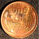
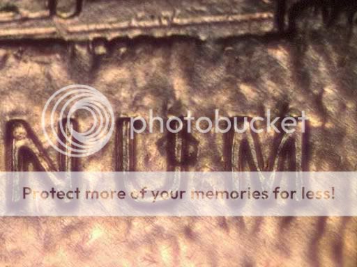
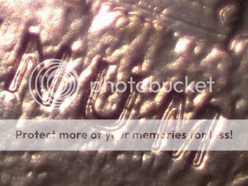
2009P incuse lettering die wear
|
  |
| Author |
Message |
 MorgansRmineAdvanced Member MorgansRmineAdvanced Member
Posts: 132
Joined: 12 Apr 2009
Location: Raleigh, North Carolina
|
|
 Posted: Mon Jul 20, 2009 9:51 am Posted: Mon Jul 20, 2009 9:51 am |
 |
|
Seems to me that raised lettering on the die would wear down rather quickly. Is that what I'm seeing on this coin ?
|
|
|
|
|
 |
 DickExpert Member DickExpert Member
Posts: 5780
Joined: 21 Sep 2006
Location: Rialto, CA.
|
|
| Posted: Mon Jul 20, 2009 10:05 am |
|
|
Good question! I noticed the "new style" of the lettering, and frankly, don't care for it, but I am only one. There are several theories that could apply, but the "deed is done",and will continue to be done, I guess.
Looks likt the FY is going to be another "Minnesota quarter type" coin. I think there are at least 35 dies, so fat, identified, or at least 35 new listings. the next in the series, with "all that lettering" should really make a splash"!
Dick
_________________
" Deja Moo: The feeling that you've heard this bull before".
|
|
|
|
|
|
 coppercoinsSite Admin coppercoinsSite Admin
Posts: 2809
Joined: 29 Jun 2003
Location: Springfield, Missouri.
|
|
| Posted: Tue Jul 21, 2009 9:17 am |
|
|
I am relatively certain that what you are seeing there is not hub doubling, but I kind of doubt it's die wear too. It could have something to do with the 'ghost doubling' seen on some other coins when they are hammer struck with excessive pressure. Not sure though.
_________________
C. D. Daughtrey
owner, developer
www.coppercoins.com
cd@coppercoins.com
|
|
|
|
|
|
|
|
|
| Page 1 of 1 |
|
|